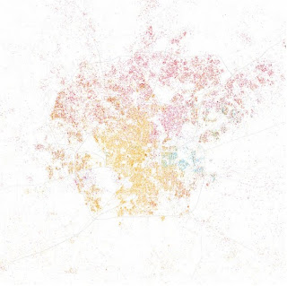
 San Antonio
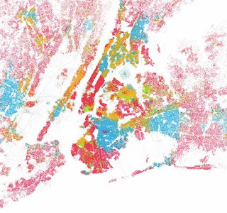
Fast Company published these and other images of cities on Sept. 20, 2010. Eric Fischer made maps of the top 40 cities in the United States that are modeled after Bill Rankin's map of Chicago. Each dot represents 25 people and each color represents a different race: "White is pink; Black is blue; Hispanic is orange, and Asian is green." I chose the two cities above to show the stark differences in America. In New York City, there are definite boundaries with all the people compacted together. San Anthonio has a greater population of Hispanics towards the city center but otherwise it is a pretty even spread between Whites and Hispanics.
I think these graphics are strong because it lets the reader make their own inferences about the city's integration or segregation - all the graphic does is present the information. I would enhance this graphic by including the total population of the city, as well as the population breakdown of each race. A way to make this graphic interactive would be to let readers choose to compare cities side by side.
I think these graphics are strong because it lets the reader make their own inferences about the city's integration or segregation - all the graphic does is present the information. I would enhance this graphic by including the total population of the city, as well as the population breakdown of each race. A way to make this graphic interactive would be to let readers choose to compare cities side by side.

No comments:
Post a Comment