"'Birth Tourism' a Tiny Portion of Immigrant Babies," ABC News, Sept. 3, 2010
This graphic has the potential to be a stand-alone image. A strength is that the pie chart shows the information well by showing the parts of the whole. I think the main weakness is that the graphic does not say if the illegal immigrants are just from Latin America as the story suggests or if the immigrants are from all over the world. Another weakness is in the colors of the pie chart. The light red that categorizes all immigrants could give the reader the idea that all those people are in the United States illegally. To enhance the story, I would give the legal immigrants a different shade of red or I could change the color totally since red usually gives off a "warning" vibe.


"Four Job Market Trends We WON'T Be Celebrating This Labor Day," The Huffington Post, Sept. 5, 2010
A strength of the first chart titled "Productivity and Median Compensation Growth" allows the readers to understand that while people are paid less, their employers are expecting more work out of them. It makes the reader question what is fair about that result?
The second chart titled "Median Real Income for Working-Age Households" has a weakness that it only gives one level of information. It's not possible to get more information from it because only one data set is presented.
The third chart titled "Wage Growth and Unemployment Rate" is strong because it lets the reader interpret something from the data. They can conclude that the people who kept their job aren't as lucky as some people think they are because they might have experienced a wage cut.
The fourth chart titled "Nominal Weekly Earnings Growth for Full-Time Workers" is weak because x-axis is confusing. The years are listed with the most present year first, which is not the typical way of thinking about chronology.
A strength of all these graphics is that it shows a history of many years. It allows the reader to be sure it's not just a short trend portrayed in the graph. Each graphic has the right kind of chart to portray the information it wants to. The two to three sentences under the chart helps make it more understandable too. If more of the information could be combined onto two or three charts, the reader would probably spend more time on them instead of clicking "next" to see each chart individually. These graphics need the story to explain why the charts are important. These charts obviously got a reaction out of readers because there are 234 comments.
 "USA TODAY Snapshots," USA TODAY, Sept. 4, 2010 (Under the "Life" tab)
This graphic stands alone well and uses the bar chart correctly. The bar chart gives the information in an easily understood way that quickly lets the reader get the message. The hammock gives the graph a nice visual touch that makes it more eye-catching. It also makes the graphic look like a vacation. The illustrator also makes the week's layout easily understood because it starts with Sunday. Conveniently, it makes the hammock easily hangable! A weakness is that there is only one side to the information. A graphic should let you look at it and get more information from it the longer you examine it. To enhance this story, I would have tried to include what people like to do for their vacation or relaxation time.

"Electronic recyclable rates gain in 2010," Columbia Missourian, Sept. 2, 2010
This graphic has the potential to stand alone; it needs a small text box that explains that they have almost reached the last year's numbers in two collections. If the reader examined the graph long enough, they would probably be able to deduce that information. The bar chart works well here because it makes it easy for the reader to compare the quantities of items collected over the last two years. A strength is the dual colored bars which makes the years easily distinguishable. A weakness is that the light bars for 2009 is difficult to see against the white background. This is a pretty straight forward facts story so I do not think it needs much enhancing.
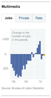
"U.S. Jobs Lost in August, but Fewer Than Expected," New York Times, Sept. 3, 2010
The first graphic titled "Jobs" is strong visually in showing how the number of jobs changed. It could be stronger in marking the time as it passes - is each individual bar a quarter of the year? Is it every two months? It's left up to the reader to wonder, which distracts them from the data presented.
The second graphic titled "Private" lets the chart show how the private sector is fairing better than the the general sector.
The third graphic titled "Rate" gives a better view that the job market is doing better than it did two years ago, even though the individual "Jobs" and "Private" charts do not exactly give the reader that impression. This graphic would have been stronger if more than three years were shown.
These are the right kind of charts to use to present this information. To enhance this story, it would have been helpful if the first and second charts could be combined so they could be compared side by side. The graphs could stand alone if there was a text box letting the reader know that new statistics had been released.


No comments:
Post a Comment