Thursday, September 23, 2010

5 Diagrams

"Wasp preys on emerald ash borer larvae," Minneapolis Star Tribune, Sept. 22, 2010.

This diagram tells the reader what the problem is and one solution that is being tested. I think all the words overwhelm the diagram but they are necessary because the diagram alone would not tell the full story. The numbers help guide the reader through the diagram. Also, I think the illustration of the ash tree is weak. The reader has to find the label that says "Ash bark" to understand that the gray stripe is bark. The general label and description of the living wood is the only thing that tips the reader off that that is wood. I think a strong element of this diagram is the real-life photo of what the wood looks like after the larvae eats it. I think it needs a label so that someone unfamiliar with trees would not have to guess what it is. This diagram could be made interactive by having the reader click on the wasp to start the process and having an explanation pop up. By clicking on the wasp again, the next step and explanation would appear, and so on and so forth. If that change was made, the diagram would become an animation, not a diagram.


"The Secrets of a Passive House," New York Times, Sept. 25, 2010.

This is a strong diagram because of all the different elements it shows. It focuses on the heating and cooling of the house. It could have made this graphic very detailed and confused. Instead, the diagram is made stronger because it gives the main components of a "passive house." By showing close-ups of parts of the house, it lets the reader know what they are looking at, where it is located, and how it works. This would have been difficult to make the diagram interactive. One way to do with would have been to make a "hot spot" where each of the close-ups are so the reader could click on that, and then have the explanation pop up. This diagrams stands alone well because of the way the information is explained.


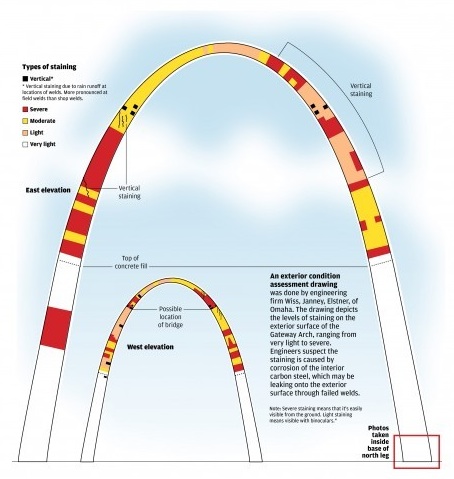
"Arch Staining," St. Louis Post-Dispatch.

This graphic stands alone and explains the staining that is happening to the St. Louis Arch. this graphic is strong because the colors are variety enough that it is easy to tell the difference in the degrees of severity. Also, the larger image lets the reader get a closer look at the staining while the smaller image shows what is happening to the other side. This is a good idea because the Arch is a 3D object so one image is not going to be descriptive enough. I think it would be difficult to make this graphic interactive.


"Rain, sun spawn nature's artwork," USA TODAY.

This is a strong interactive graphic, although I could not get more than one image of it. When the reader puts their cursor over the image of the cloud on the left, a rainbow appears. When the cursor is scrolls over the image on the right, a beam of light is shined into the water droplet which emits a rainbow out the other side. The information on the right of the images also changes. This graphic explains how a rainbow is made. The interactivity makes the process understandable to a reader who has not studied rainbows before. If this graphic had been larger, it would have been stronger. This graphic can almost stand alone. Part of the article explains that a person needs to have the sun behind them to see the rainbow. This is not totally explained in the graphic, but could be if the design had made that evident.


"MU football lineup v. Miami of Ohio," Columbia Missourian, Sept. 24, 2010.

This is a well-made graphic because of the amount of information included in it. I like that it shows how the players line up by position and saying who plays that position for the team and their number. It's nice that the reader doesn't have to refer to a player roster to find out who plays that position. The colors work well here because they correspond with the team colors and are easily distinguishable. The key for offense and defense is nice because it explains the abbreviations. This diagram could have been made interactive if the reader could scroll over the name of the player and their picture would pop up. This graphic stands alone well.

Wednesday, September 22, 2010

Don't Ask, Don't Tell


The Senate voted on Sept. 21, 2010, on whether or not to repeal the U.S. military's "Don't Ask, Don't Tell" policy. The Senate rejected it, and a main factor in it's rejection is that no Republicans voted to repeal it.

This is a strong graphic because the map shows exactly how each state senator voted. It also gives a legend that tells the reader the exact number of how many senators voted which way.


There is also a bar chart above the map (shown above) that gave another view of how many senators from each party voted in a certain way. It makes it visually evident that Democrats wanted to repeal the policy while Republicans did not.

Below both of these graphics is a list that specifically states how each senator, with their state listed, voted.

All this information in different formats allows the reader to analyze how their state senator voted and how that compares to the rest of the country. This is a good graphic because of all the different presentations. It would be stronger if the specific list could be combined with the map by letting the reader scroll over or click on the state and see how both senators voted.

Tuesday, September 21, 2010

Coral


The New York Times published this map about where coral is in danger on Sept. 20, 2010. The coral gets rid of its color in order to try to survive. The only other time this has been known to happen was in 1998, the hottest year on record. Scientists say that there are signs that this year could be worse than that year.

This graphic is strong because the colors follow what people naturally perceive. People automatically interpret the darkest colors to be the most serious condition and in this map, the brown notes the areas that are in the most danger. The world map is also one that is familiar to most people.

The map could be enhanced and interactive if readers were able to click on the endangered areas of the ocean. The name of that part of the ocean, the average temperature in that area, and the top temperature the National Oceanic and Atmospheric Administration predicts for that area could appear next to where the reader clicked.

Monday, September 20, 2010

Ethnic Mapping

New York City


San Antonio

Fast Company published these and other images of cities on Sept. 20, 2010. Eric Fischer made maps of the top 40 cities in the United States that are modeled after Bill Rankin's map of Chicago. Each dot represents 25 people and each color represents a different race: "White is pink; Black is blue; Hispanic is orange, and Asian is green." I chose the two cities above to show the stark differences in America. In New York City, there are definite boundaries with all the people compacted together. San Anthonio has a greater population of Hispanics towards the city center but otherwise it is a pretty even spread between Whites and Hispanics.

I think these graphics are strong because it lets the reader make their own inferences about the city's integration or segregation - all the graphic does is present the information. I would enhance this graphic by including the total population of the city, as well as the population breakdown of each race. A way to make this graphic interactive would be to let readers choose to compare cities side by side.

Thursday, September 16, 2010

Civilian space travel - sign me up!

On Sept. 15, 2010, The New York Times published an article about Boeing's announcement that they are going to start sending civilians into space and how that will affect NASA. The article included this graphic from Boeing.

I like this graphic diagram because it gives the details of the cabin without being too over complicated and includes another picture of what the cabin will look like from the outside. The author could have left the graphic out but the visual lets the reader have a better understanding of what Boeing is going to be making. The difference in colors helps distinguish between the different parts, which is helpful. The black background also makes the parts of the cross section easier on the eyes.

A way to enhance this graphic would have been to let the reader click on different parts to see what they do or click on the people to see how much space they will have in the cabin. That would also make the diagram interactive, which would involve readers more.

Saturday, September 11, 2010

5 Maps

"Karzai Divides Afghanistan in Reaching Out to Taliban," Wall Street Journal, Sept. 10, 2010.

This interactive map is neat because of how it is possible to view each ethnic group. The main view lets the reader see all the ethnic groups together. The instructions are unclear as to whether the reader clicks on the map or the legend next to the map to see the specific information about each group. That is something that could be improved. But, once that function is figured out, the provinces can be highlighted one by one and gives insight into why politics in Afghanistan are so complicated. The choice to show provinces is left up to the reader which lets them decide if they want to see how ethnic groups share provinces. It would also be helpful to know why part of the country is left white. This map can stand alone because it includes a background paragraph, instructions for use, and detailed information.


"World Trade Center: New site takes shape after many twists and turns," AP via msnbc.com, Sept. 11, 2010.

This graphic gives a lot of information in a small space. It is a graphic that the more time a reader spends with it, the more information they will gain from it. The aerial view lets the reader place where the World Trade Center site is in relation to the rest of the island. The 3D view of the site lets the reader have perspective on the placement of the buildings and their sizes relative to each other. When the reader scrolls their mouse over the buildings, it tells them what the building will be. The "Height Comparison" graphic allow the reader to see how architecture has progressed over the years. When the readers scroll their mouse over those buildings, a text box pops up with information about the height of the building and when it was the tallest in the world.

The tabs on the graphic also let the reader see a photograph of how the construction of these buildings is coming at the WTC site. It provides a real-world picture so people can gauge for themselves how well the progress is coming.


"ABC Coverage Map for September 11," ABC News, Sept. 11, 2010

College game days are exciting times if you live in the college town. If you're an alum and live far away, the best option you have is to either travel to the game or watch it on TV. Most alums choose the second option. This map lets a viewer quickly figure out if they will be able to watch the game they want to. The easy color coding with a clear legend gives the information without the viewer having to question if they will be able to see the game or not. This map can stand alone with the information provided. This graphic could have been enhanced by making it interactive. For example, a viewer could click on their state, which would zoom in on the state and the viewer could choose their town from there. It would give them the local time of the game and what channel to find the game.


"House Race Ratings," New York Times, Sept. 10, 2010.

This is another map where the more time spent with it, the more information it will reveal. Readers can click on different areas of the map and figure out what district it is, which political wing they favor, the date of the primary, and the incumbent's name. By clicking on the link, district-personalized information is available. The color of the district also gives the political wing information. At the bottom of the map (not pictured) is a categorized list grouping districts by which political direction they lean. One of the options on the left sidebar lets readers choose to look at the Senate's midterm elections race. The other options on the left sidebar gives readers more information about the midterm elections. The bar graph across the top of the map makes it visual to see exactly how the political parties stack up against each other. I think that all the interactivity of this map is a strength and lends to the usefulness of the map. It would be hard to enhance this graphic further but this map can stand alone.


"Location of Fatal Shooting in Columbia," Columbia Missourian, Sept. 6, 2010.

The map shows the readers exactly where the shooting happened on Labor Day 2010. I actually was the reporter for KOMU 8 on this story. From personal experience, this map perfectly notes where the apartment was location, even down to the fact that it was not place perfectly on the cul-de-sac. I thinks a weakness of this map is that it does not make Old 63 a bolder line to denote that it is a bigger road. A strength is that the lake and park are placed on the map to give readers a familiar reference. This map could have been made interactive by having the red box be a hot spot that pops up a text box with information about the shooting. This graphic cannot stand on its own because it does not tell the story of the shooting.

Thursday, September 9, 2010

Creationism v. Evolution... Or Together?


Francis Collins, a geneticist, was appointed by President Obama to be the Director of the National Institutes of Health. He cleared his Senate confirmation hearings without a problem, but then his fellow scientists began to question the President's choice. The details are in Peter J. Boyer's article titled, "The Covenant," published in The New Yorker on Sept. 6, 2010. The basic idea is that Collins is a Christian, which is unusual among scientists. Collins tries to combine the idea that a divine power created humans and evolution. As the sentence beneath the graphic states, Obama wants "harmony between science and religion" so Collins' ideals matched the President's.

I think this graphic is strong because it visually represents the effort it will take to combine these two ideas. It will be literally an uphill battle to make these two different schools of thought see "eye-to-eye," as the popular phrase says. The overwhelming blackness from the hill gives the reader a sense of doom, eluding to the idea that this is an almost impossible task.

A weakness of this graphic is that Collins is represented so small that it takes a minute to figure out that that is who is represented. Collins is not a totally recognizable public figure, but Boyer did describe what he looks like in the article so a bigger Collins would have worked. The only hint that lets the reader figure out it is Collins at the top of the hill is the white scientist's coat. At the same time, the small stature of Collins could be representing that Collins is a small part of this big debate, that is represented by the massive black hill.

This graphic does not give away more information the longer the reader examines it, so it's not very complex. The way to make it interactive would be for the reader to be able to click on each set of symbols (the Jesus walking the cross up the hill, Collins, and the evolving humans) to read quotes from each side of the debate.

Tuesday, September 7, 2010

Self-Embedding Objects


In this CNN story (Sept. 9, 2010) on their "the chart" blog, the subject of the matter teenagers embedding foreign objects into their bodies.

This graphic above originally caught my attention because I couldn't figure out what the squiggly lines in the elbow were. Turns out, this 17-year-old's elbow has "staples (shown by straight arrows), an unfolded paper clip (curved arrow), and graphite fragments (arrowheads)." I think a strength of this graphic is that it uses the actual x-ray. If the graphic illustrator decided instead to make a popularity chart of embedded objects, I would find it interesting but this brings the issue home. It lets the reader see how far the objects are pushed into the body and mentally envision putting those objects in their own arm. Using different arrows to indicate different objects is strong too. A legend near the graphic would have been helpful, instead of having to read through the article to find the key. A weakness of this graphic is that the arrows are a color that's involved in the graphic. If the arrows are meant to blend in, that's one thing. But a quick glance might lead the reader to believe the arrows are in the arm. Arrows of a different color than white would be helpful because it would be obvious that it's not a part of the x-ray.

There is no option for interactivity or enhancement of this graphic. It is meant to be a demonstrative graphic.

Sunday, September 5, 2010

5 Charts


"'Birth Tourism' a Tiny Portion of Immigrant Babies," ABC News, Sept. 3, 2010

This graphic has the potential to be a stand-alone image. A strength is that the pie chart shows the information well by showing the parts of the whole. I think the main weakness is that the graphic does not say if the illegal immigrants are just from Latin America as the story suggests or if the immigrants are from all over the world. Another weakness is in the colors of the pie chart. The light red that categorizes all immigrants could give the reader the idea that all those people are in the United States illegally. To enhance the story, I would give the legal immigrants a different shade of red or I could change the color totally since red usually gives off a "warning" vibe.


"Four Job Market Trends We WON'T Be Celebrating This Labor Day," The Huffington Post, Sept. 5, 2010

A strength of the first chart titled "Productivity and Median Compensation Growth" allows the readers to understand that while people are paid less, their employers are expecting more work out of them. It makes the reader question what is fair about that result?

The second chart titled "Median Real Income for Working-Age Households" has a weakness that it only gives one level of information. It's not possible to get more information from it because only one data set is presented.

The third chart titled "Wage Growth and Unemployment Rate" is strong because it lets the reader interpret something from the data. They can conclude that the people who kept their job aren't as lucky as some people think they are because they might have experienced a wage cut.

The fourth chart titled "Nominal Weekly Earnings Growth for Full-Time Workers" is weak because x-axis is confusing. The years are listed with the most present year first, which is not the typical way of thinking about chronology.

A strength of all these graphics is that it shows a history of many years. It allows the reader to be sure it's not just a short trend portrayed in the graph. Each graphic has the right kind of chart to portray the information it wants to. The two to three sentences under the chart helps make it more understandable too. If more of the information could be combined onto two or three charts, the reader would probably spend more time on them instead of clicking "next" to see each chart individually. These graphics need the story to explain why the charts are important. These charts obviously got a reaction out of readers because there are 234 comments.


"USA TODAY Snapshots," USA TODAY, Sept. 4, 2010 (Under the "Life" tab)

This graphic stands alone well and uses the bar chart correctly. The bar chart gives the information in an easily understood way that quickly lets the reader get the message. The hammock gives the graph a nice visual touch that makes it more eye-catching. It also makes the graphic look like a vacation. The illustrator also makes the week's layout easily understood because it starts with Sunday. Conveniently, it makes the hammock easily hangable! A weakness is that there is only one side to the information. A graphic should let you look at it and get more information from it the longer you examine it. To enhance this story, I would have tried to include what people like to do for their vacation or relaxation time.


"Electronic recyclable rates gain in 2010," Columbia Missourian, Sept. 2, 2010

This graphic has the potential to stand alone; it needs a small text box that explains that they have almost reached the last year's numbers in two collections. If the reader examined the graph long enough, they would probably be able to deduce that information. The bar chart works well here because it makes it easy for the reader to compare the quantities of items collected over the last two years. A strength is the dual colored bars which makes the years easily distinguishable. A weakness is that the light bars for 2009 is difficult to see against the white background. This is a pretty straight forward facts story so I do not think it needs much enhancing.


"U.S. Jobs Lost in August, but Fewer Than Expected," New York Times, Sept. 3, 2010

The first graphic titled "Jobs" is strong visually in showing how the number of jobs changed. It could be stronger in marking the time as it passes - is each individual bar a quarter of the year? Is it every two months? It's left up to the reader to wonder, which distracts them from the data presented.

The second graphic titled "Private" lets the chart show how the private sector is fairing better than the the general sector.

The third graphic titled "Rate" gives a better view that the job market is doing better than it did two years ago, even though the individual "Jobs" and "Private" charts do not exactly give the reader that impression. This graphic would have been stronger if more than three years were shown.

These are the right kind of charts to use to present this information. To enhance this story, it would have been helpful if the first and second charts could be combined so they could be compared side by side. The graphs could stand alone if there was a text box letting the reader know that new statistics had been released.

Friday, September 3, 2010

Economic Report


"Companies add 67K workers, but jobless rate rises," AP via Yahoo! News, Sept. 3, 2010

I found this graphic on Sept. 3, 2010, on Yahoo! News. It is an AP story about the latest report on the economy. I think this is a strong graphic. From the colored arrows, it is clear that the economy is not growing as fast as people wish to think it is. The statistics give the graphic hard facts for the reader to decide how bad they think the decline or good the rise is. The confusing part is that the graphic says that the unemployment rate is unchanged, but the title of the story says that the jobless rate rises.

The graphic is interactive because the reader can click on the arrows for more information on that specific topic. The graphic could be enhanced with information if it told you the percentage was a rate change over what specific time period.

I know the main news from this economic report was about the jobs but this graphic does a good job of relating that information to other economic markers.

Thursday, September 2, 2010

Mariner Energy Oil Rig Fire


During the chaotic hours after the Mariner Energy oil rig caught fire on September 2, 2010, news media outlets were tweeting and posting online the latest news they received as they got it. Culture Map Houston posted this graphic that notes where this oil rig fire is (on the left with the blue line) compared to the Deepwater Horizon explosion and leak. They also posted with the graphic the first picture of the fire (link). This was the first graphic I saw of where the rig is located and it is quoted as "Courtesy of Shane/Google Maps". The audience for this graphic would be anyone who is following the news of the fire.

I think this is not the strongest graphic but due to the breaking news aspect, it is good. To make it stronger, I would have liked the image to be zoomed in more. None of the words on the map are readable and the graphic cannot be clicked on to be made larger. Because I cannot read the words, my main landmark is the "boot" of Louisiana.

I think the graphic could also be enhanced if the date and time of explosion were noted next to both fire icons. Also, more information, like a timeline of the events that is update as new information rolls in, would make the graphic convey more information. The graphic could be made interactive if the reader clicked on the fire icon and it took them to the timeline of events.

I understand in the haste of the breaking news it was difficult to gather lots of information and make a complicated graphic. I was happy to finally see a map that told me where the rig was located.