
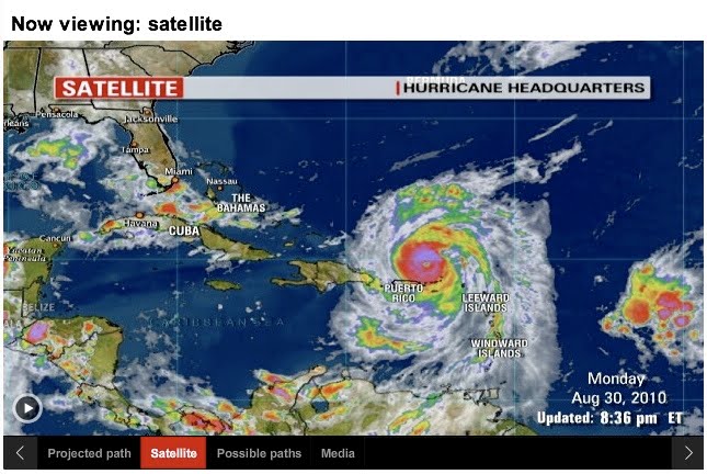


This graphic I originally found Sunday, August 29th. It had Hurricane Earl listed as a Category 1 hurricane (1 red dot). I took the picture of the graphic on Monday, the 30th, and the graphic had been updated to reflect the hurricane's Category 4 status (4 red dots). A fourth tab titled, "Media," had also been added. I believe this graphic does a good job of demonstrating how a graphic can be continuously updated to remain relevant and does not need to be a one-time use instrument. The audience for this graphic is wide-ranging, from people who are interested in hurricane storms, to people who might live in or know someone living in the path of the hurricane, to people concerned about how another natural disaster will affect the United States' economy.
It's a CNN.com story that is trying to help the readers know where Hurricane Earl is headed and it's characteristics. One of the strengths of this graphic is the amount of information it conveys. Not only does it list statistics at the top of the graphic, but it also has more relevant information (time of and strength upon arrival to a location) within the image. It also lets the reader know how up-to-date the information is by the "Updated" status in the lower right corner of the image. The tabs bring more information to the graphic. The first graphic gives the best guess of the route the hurricane will take. The second tab shows what the hurricane looks like from a satellite image. The third tab shows a map of the other possible paths and the fourth shows photos iReporters, or citizen journalists, have sent in. The tabs of this graphic give several different views of the storm system: digitally drawn lines, an image from space, and images from the ground. They successfully present the information in a variety of ways so that everyone can understand it.
They do not need to add anything to give the piece context because of another feature added to the graphic. The drop-down menu that reads "Other 2010 storms: Please select a storm" gives the reader the ability to compare the current hurricane to the past three that have happened this year (Alex, Bonnie, and Colin). The design of this graphic is well thought-out so it is very effective. The graphic almost eliminates the need for the article, except that it does not have the statistics for projected rainfall that are included in the article.
The interactivity of this hurricane map makes hurricanes more interesting because the audience can investigate multiple angles or parts of a hurricane. The buttons are easy to click and read and the graphic does not take too long to load when going between tabs.
Overall, this graphic is interesting and I will be going back for updates on Hurricane Earl until the storm passes.
No comments:
Post a Comment